The Ford Taurus of Sea Otter
If you recall, the late 80’s and early 90’s Ford put out a really ugly car called the Ford Taurus. No matter how much they dolled it up, it was still an ugly Taurus. It’s kinda like that saying (slightly modified) “If you put lipstick on Ugly…its still Ugly.”
So here were are looking at the Ford Taurus of Sea Otter. Mountain Cycle makes some wacky looking DH frames.
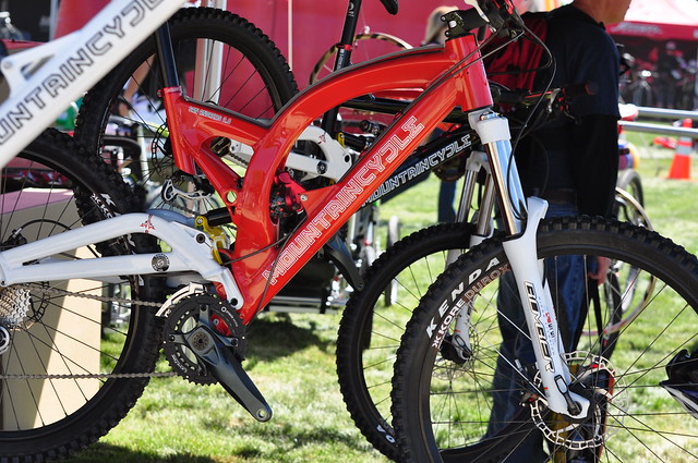
Ok, this one isn’t so bad…but it gets better or worse, depends on your perspective.
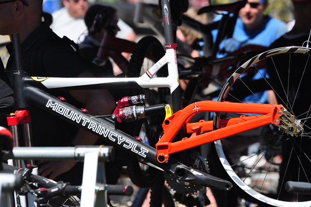
That top tube gives free prostrate exams.
Ok I know I was a bit harsh, but the only saving grace that Mountain Cycle has would be this little number. It’s called the TwentySixand Six
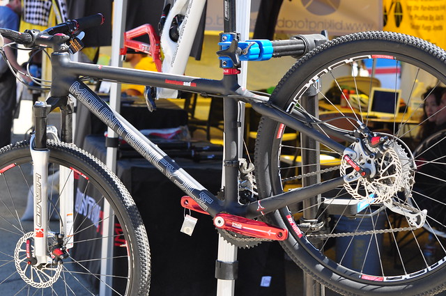
Nice carbon frame.
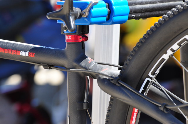
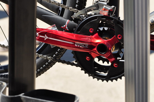
Check it out, they even have their house brand components. I do like the anodized red.
Perhaps Mountain Cycle thought that if they design their bikes the way they do, it will stand out from the rest. With all the technology and abilities to design and create a beautiful frame, you’d think they’d take advantage of it.
I agree. That red framed DH is a bit too unconventional that is beginning to border on the ugly side. It looks too moto-inspired; curved top tube akin to a gas tank.
The ugliest bike I’ve seen other than those pseudo-full suspension bike found at Walmart/Target/Toys r Us was that Pronghorn bike where the shock is mounted OVER the top tube.
brutal. so are they good performing bikes? how do they compare to their peers?
I’m sure their bikes work just great, its more of an aesthetics thing than performance.